Customer Churn Explainability Dashboard
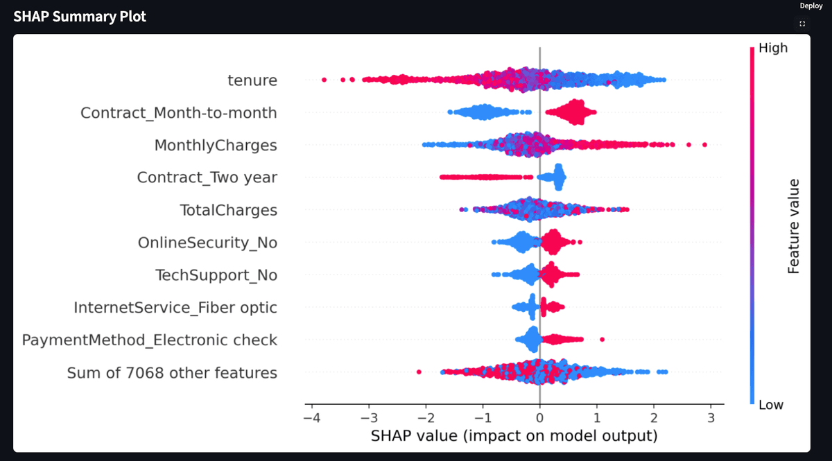
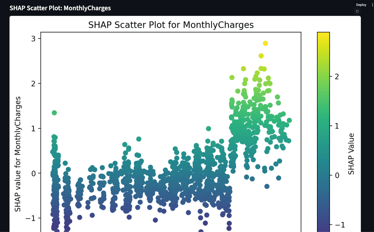
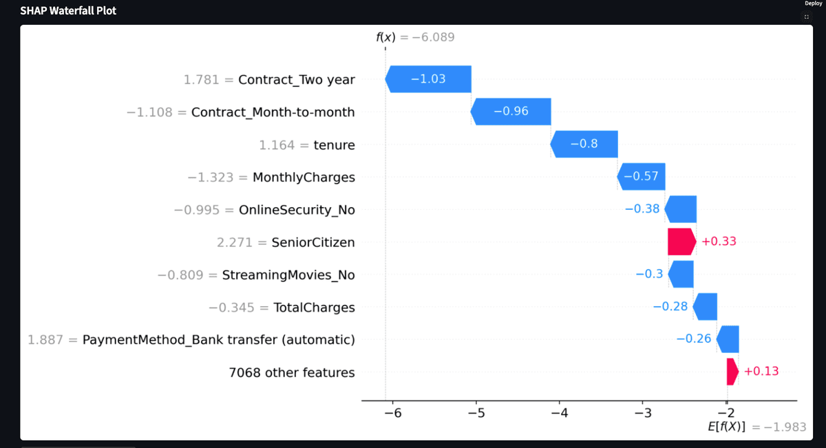
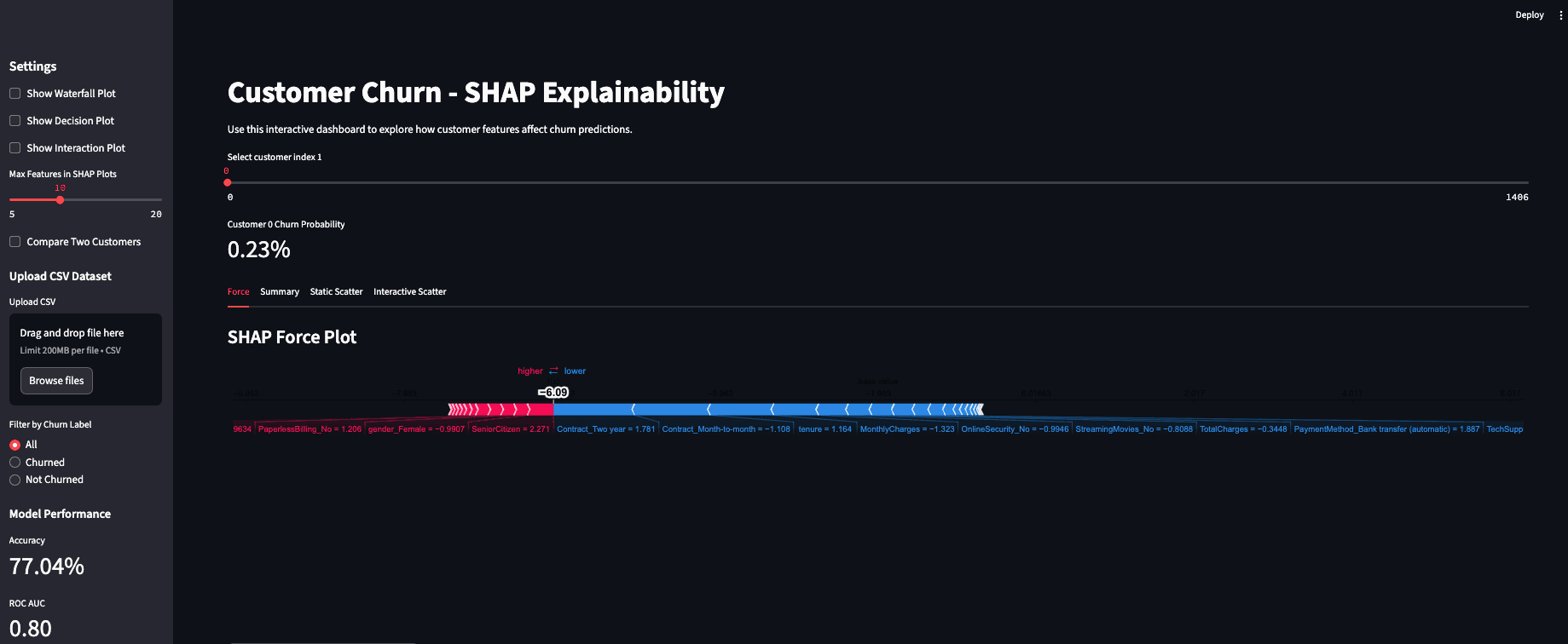
This interactive Streamlit dashboard uses SHAP (SHapley Additive exPlanations) to interpret and explain machine learning predictions for customer churn. Built using Python, XGBoost, SHAP, and Streamlit, this tool allows users to upload data, generate model performance metrics, and visualize SHAP explanations through multiple plot types.
🔍 Features
- Upload custom CSV datasets
- Train XGBoost model and view accuracy & AUC
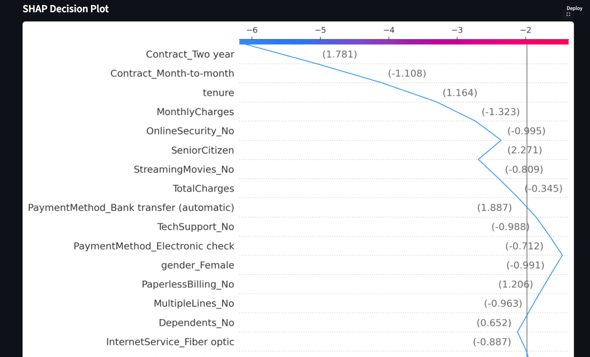
- SHAP Force, Summary, Scatter, Waterfall, and Decision plots
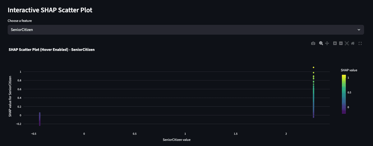
- Interactive SHAP scatter by selected feature
- Export all visuals to PDF
📂 Tools & Tech
- Python (XGBoost, SHAP, Pandas, Matplotlib)
- Streamlit for interactive web app
- Plotly for interactive visualizations
- Jupyter Notebook for model development
📸 Screenshots